No Domain in Shopping Cart
Understanding the color psychology in logo design is crucial for brands trying to convey their message effectively. Primary colors like red serve as a powerful color, often used by brands to invigorate their image.
The meaning behind logo colors can significantly shape brand perception. The colors you choose reflect your brand's identity.
What Do Different Logo Colors Mean to Consumers?
When a potential customer sees your brand for the first time, they form impressions almost instantly. Research shows that 85% of consumers cite color as the primary reason for purchasing a product, and about 42% form brand perceptions based solely on logo color.
Colors create emotional responses that can either attract or repel your target audience. Red makes people feel hungry and excited, while blue builds trust. That's not coincidence—it's color psychology at work.
Let's break down what specific hues might say about your brand:
How Does Red Impact Your Brand's Logo?
Red logos grab attention and create a sense of urgency. This warm color is physically stimulating—it can actually increase your heart rate and make you breathe faster.
Brands like Coca-Cola, Netflix, and YouTube use red to exude energy and passion. Red may work particularly well for companies wanting to convey excitement or create an energetic punch in their visual identity. Food brands often use this hue because it's been shown to stimulate appetite—that's why you'll see it in logos for companies like BurgerFi.
Why Are Blue Logos So Common in Corporate Branding?
Blue appears in 40% of Fortune 500 logos, making it the most common color choice for major corporations. Why? Blue conveys reliability, trustworthiness, and professionalism—attributes that businesses like Facebook, Intel, and Samsung want associated with their brands.
The finance and tech sectors particularly favor blue because it helps build trust. That's why companies in these industries frequently pair this calming hue with names like TrustBank or SecureNet to strengthen the association.
This popularity creates a challenge: how do you stand out from the crowd when using such a common color? The answer often lies in finding the right shade and pairing it with secondary colors that help differentiate your brand.

What Makes Yellow Logos So Attention-Grabbing?
Yellow logos are like a visual shout. They create feelings of optimism, clarity, and warmth.
According to recent trends, bright yellows (like #FACF39), mustard (#FFC93C), and canary (#FCE38A) dominate 2025 trends, reflecting a cultural shift toward positivity and energy.
Brands like McDonald's and Ikea use yellow to convey friendliness and approachability. This hue can be particularly effective for brands wanting to appeal to younger audiences or position themselves as innovative and forward-thinking.
When used as a focal color, yellow can help a brand stand out in crowded markets, though its high visibility means it should be used thoughtfully.
How Can Green Logos Connect With Modern Consumers?
Green represents growth, health, and sustainability. It's a versatile hue that can convey everything from wealth (darker shades) to freshness (lighter tones).
Green isn't linked to any one emotion but instead creates a sense of balance and harmony. It's particularly effective for brands in the wellness, environmental, or financial sectors—think Whole Foods, Animal Planet, or H&R Block.
With ethical consumerism on the rise, eco-friendly color names like green and aquamarine are increasingly linked to ethical brand perceptions, even when companies don't have strong sustainability practices. This creates both opportunities and responsibilities for brands choosing this color.
When Should Your Brand Choose Black or White for Its Logo?
Black logos exude elegance, sophistication, and authority. Luxury brands like Chanel and Gucci use black to communicate exclusivity and premium quality. This absence of color creates a bold statement that can make or break a brand's perception.
White, on the other hand, represents simplicity, purity, and minimalism. It's often used as negative space or as a complementary element rather than a primary logo color.
It's worth noting that monochromatic contrasts (stark black-and-white combinations) are increasingly popular for their minimalist aesthetic and versatility.
However, brands should be aware that white symbolizes purity in Western cultures but mourning in parts of Asia—a cultural difference that can affect global brand perception.
How Does Purple Influence Brand Perception?
Purple combines the stability of blue with the energy of red to create a sense of creativity, wisdom, and luxury. Historically associated with royalty (purple dye was once extremely rare and expensive), this hue continues to carry connotations of prestige.
Brands like Yahoo, Twitch, and Cadbury use purple to stand out from competitors while maintaining an air of quality. It's considered a more feminine color in Western cultures, though this perception is gradually shifting.
Purple can be particularly effective for beauty, creative, or premium brands looking to differentiate themselves while maintaining sophisticated appeal.
What Role Do Brown and Earth Tones Play in Logo Design?
Earthy tones like clay (#C99383) and wood (#B17A50) are rising in popularity, signaling a desire for tradition, reliability, and grounding. Brown conveys a sense of stability, warmth, and dependability.
Brands like UPS, M&Ms, and Coffee Bean use brown to invoke feelings of reliability and comfort. It's particularly effective for companies wanting to convey a sense of history, craftsmanship, or connection to natural products.
This trend toward "neo-traditional" names tied to earthy tones (like Terracotta Labs) is expected to continue growing throughout 2025, reflecting consumers' desire for authenticity in an increasingly digital world.
How Do Multi-Colored Logos Impact Brand Recognition?
Multicolored logos (like those of Google, Microsoft, and eBay) convey diversity and creativity while allowing brands to capture a broader range of emotional associations. These vibrant combinations can make a brand appear more playful, dynamic, and inclusive.
However, using multiple colors presents challenges—each hue must work harmoniously with the others, and the combination needs to remain recognizable across different media and sizes.
How Does the Connection Between Logo Colors and Brand Names Work?
The relationship between a brand's name and its colors can strengthen overall brand identity when strategically aligned.
Color names like "True Blue" (#137DC5) or "Midnight" (#112D4E) evoke specific emotions (trust, sophistication) that can influence brand naming. This semantic alignment helps explain why tech companies might choose names like Azure while pairing them with blue logos, or why sustainability-focused brands might opt for names like Evergreen alongside green visual branding.
Naming strategies often pair color-associated terms with cultural values (e.g., "Clay" for artisanal brands, "Aquamarine" for wellness), creating stronger emotional connections with target audiences.
What Should You Consider When Choosing Logo Colors for Different Industries?
Different industries have established color associations that can either be leveraged or deliberately broken:
|
Industry |
Common Colors |
Emotional Associations |
Example Brands |
|
Technology |
Blue, Gray |
Trust, Innovation, Reliability |
IBM, HP, Dell |
|
Food & Beverage |
Red, Yellow |
Appetite, Energy, Friendliness |
McDonald's, Coca-Cola |
|
Finance |
Blue, Green |
Security, Growth, Stability |
Chase, TD Bank |
|
Healthcare |
Blue, Green, White |
Cleanliness, Tranquility, Growth |
Cleveland Clinic, Humana |
|
Luxury |
Black, Gold, Purple |
Exclusivity, Wealth, Sophistication |
Chanel, Rolex |
While following industry norms can help customers immediately understand what type of business you run, breaking conventions can help you stand out from the competition—if done thoughtfully.
How Will Logo Color Trends Evolve in the Near Future?
Current trends suggest several emerging directions in logo color usage:
-
Increased use of AI-generated color palettes to optimize emotional impact, allowing brands to fine-tune their color strategies based on data-driven insights.
-
Growing popularity of "neo-traditional" names tied to earthy tones, reflecting consumers' desire for authenticity and grounding in an increasingly digital world.
-
Dynamic gradients are being used by 34 Fortune 500 companies, modernizing logos while retaining color psychology principles. This approach offers flexibility while maintaining brand recognition.

However, some experts caution that color psychology sometimes oversimplifies cultural and contextual nuances, risking stereotypical branding if not applied thoughtfully.
What Challenges Do Brands Face When Using Color Psychology in Logos?
While color psychology offers powerful insights, it comes with several limitations:
-
Cultural misinterpretation: Colors carry different meanings across cultures. White symbolizes purity in Western cultures but mourning in parts of Asia.
-
Accessibility issues: Poor contrast (e.g., yellow on white) reduces legibility and excludes people with visual impairments from engaging with your brand.
-
Over-reliance on trends: Excessive use of gradients or monochrome can dilute brand distinctiveness, making it harder to leave a lasting impact.
-
Context sensitivity: Colors don't exist in isolation—they're affected by surrounding elements, cultural context, and personal experiences.
Successful brands recognize these challenges and develop more nuanced approaches to color selection that consider their specific audience, industry context, and global implications.
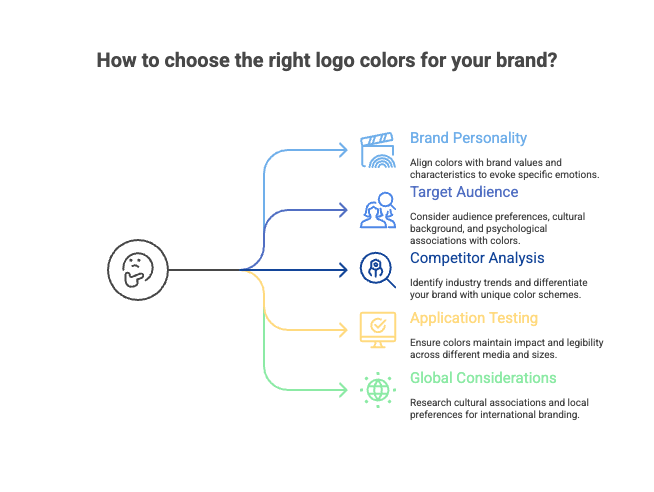
How Can You Choose the Right Logo Colors for Your Brand?
Selecting the perfect hue for your brand involves several key considerations:
-
Understand your brand personality: Are you playful or serious? Innovative or traditional? Your colors should align with these traits.
-
Consider your target audience: Different demographics respond differently to colors. Research how your specific audience reacts to different hues.
-
Analyze competitors: What colors dominate your industry? Do you want to fit in or stand out?
-
Test across applications: How will your colors look on different backgrounds, sizes, and media? Ensure they maintain impact across all platforms.
-
Think globally: If you plan to expand internationally, research how your colors might be perceived in different cultures.
The right color combination can dramatically enhance your brand recognition. Research indicates that consistent logo colors increase brand recognition by 80% and revenue by 23%, making this choice far more than merely aesthetic.
Conclusion About Logo Color Meanings
In conclusion, understanding color meanings through the color wheel is essential for brands that want to choose a logo color that resonates. Certain colors, like red, represent a universal sign of excitement, while blue appears in over half of all logos, symbolizing trust and reliability.
By applying color theory, brands can effectively communicate their identity.
For instance, blue is used frequently by brands who want to establish authority, while millennial pink to neon magenta evoke youthful energy. Utilizing one color or a combination of two colors can help a logo stand out from the competition.
FAQs
What is color psychology and how does it relate to logo design?
Color psychology is the study of how colors affect perceptions and behaviors. In the context of logo design, it plays a crucial role in shaping the viewer's emotional response to a brand.
Different colors can evoke various feelings and associations, which can significantly impact a brand's identity and how it connects with its target audience.
How do I choose the right logo color for my brand?
Choosing the right logo color involves understanding your brand's identity and the emotions you wish to evoke.
Start by considering your brand's values and the message you want to convey. Research color associations and how they relate to your industry.
What are some common logo color meanings?
Each color has its unique meanings and associations.
For instance, red is often linked to passion and urgency, making it an energetic choice for brands aiming to create excitement. yellow represents optimism and warmth, while blue conveys trust and reliability.
Understanding these meanings can help you select colors that align with your brand's message and identity.
Can I use multiple colors in my logo design?
Yes, using multiple colors in your logo design can be effective as long as they complement each other. A well-thought-out color palette can make your logo more visually appealing and memorable.
However, it's crucial to keep the design simple to ensure that the logo remains recognizable, especially at smaller sizes.
Consider using a focal color for the main elements and secondary colors for accents.