 购物车空空如也
Rebranding can transform struggling companies into market leaders—or obliterate decades of brand equity overnight. Even billion-dollar companies with world-class marketing teams make catastrophic mistakes that offer expensive lessons for smaller businesses.
Recent disasters prove the devastating stakes: Twitter's rebrand to X destroyed massive brand value according to Brand Finance data. Gap's logo nightmare required a complete reversal within days. Tropicana's packaging redesign triggered significant sales drops as customers couldn't locate products on store shelves.
For SMBs who rarely get second chances at rebranding, these spectacular failures follow predictable patterns that aren't just cautionary tales—they're essential survival knowledge for protecting hard-earned brand equity.
The Modern Digital Disasters (2023-2024)
The most instructive examples of unsuccessful rebranding come from companies that failed in the digital age, where social media amplifies mistakes instantly and customer feedback becomes a global conversation. These recent failures demonstrate how traditional rebranding wisdom doesn't always apply to platform-based businesses and digital-first brands.
Twitter's Rebrand to X

Image source: https://www.digidop.com/blog/twitter-x-new-identity-logo-challenges-elon-musk
Twitter's rebrand to X represents perhaps the most dramatic rebranding failure in modern business history. Elon Musk eliminated a globally recognized brand name that had become a verb in multiple languages, replacing it with a generic letter that confused users and advertisers alike. The platform lost its distinctive identity overnight, forcing users to relearn basic terminology while eliminating years of built-in marketing value.
Brand Finance data shows the devastating impact: Twitter was valued at $5.7 billion in January 2022, falling to nearly $3.9 billion in 2023, and plummeting to just $673.3 million in 2024.
The failure wasn't just financial. The rebrand created practical problems: users continued calling it "Twitter," business communications became confusing, and the platform's cultural significance as the place where people "tweet" was abandoned for unclear benefits. For SMBs, this demonstrates how brand recognition—even when it seems abstract—carries real economic value that can't be casually discarded.
Jaguar's "Copy Nothing" Campaign
Jaguar's controversial 2024 rebrand created an entirely different type of digital disaster. The luxury automaker deleted its entire social media history and launched with a fashion-focused video that showed no cars, alienating its core customer base of automotive enthusiasts. The campaign generated over 22 million views on X but predominantly negative responses, with even Tesla CEO Elon Musk mockingly asking "Do you sell cars?"
Marketing experts noted that while the campaign succeeded in generating buzz, it risked alienating the brand's traditional customer base without clearly attracting new audiences. This demonstrates how digital-first rebranding strategies can backfire when they ignore fundamental business reality and customer expectations.
Classic Disasters Revisited: Lessons That Still Apply
The foundational rebranding disasters of the past decade continue to offer critical insights, though their lessons must be interpreted through the lens of today's digital-first business environment. These classic unsuccessful rebranding examples established many of the failure patterns we still see today.
Gap's Six-Day Logo Nightmare
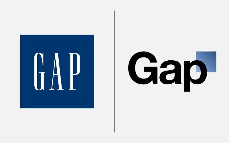
Image source: https://www.thebrandingjournal.com/2021/04/learnings-gap-logo-redesign-fail/
Gap's six-day logo nightmare remains the gold standard for rebranding disasters, costing the company $100 million before they reversed course completely. The retailer replaced their iconic blue square logo with a generic Helvetica font and small gradient square, creating a design that could have belonged to any company in any industry.
Customer backlash was immediate and brutal, with social media users creating thousands of parody logos and expressing genuine anger at the loss of a familiar brand element. The speed of Gap's reversal demonstrated both the power of customer feedback and the importance of having contingency plans when rebranding goes wrong.
The failure revealed several critical mistakes that SMBs must avoid: no customer consultation before launch, dramatic change without warning, and a generic design that eliminated brand differentiation. Design experts called it "embarrassing" and compared it to amateur work, highlighting how professional execution matters as much as strategic thinking.
Tropicana's Packaging Catastrophe
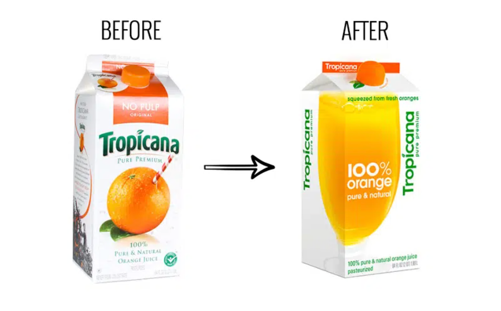
Image source: https://www.thebrandingjournal.com/2015/05/what-to-learn-from-tropicanas-packaging-redesign-failure/
Tropicana's packaging disaster offers equally valuable lessons about visual recognition and customer psychology. The juice brand removed its iconic orange-with-straw imagery in favor of a generic glass of orange liquid, causing a 20% sales drop and $30 million in losses within just two months.
Customers literally couldn't find the product on store shelves, proving that packaging serves as a critical identification tool beyond mere aesthetics. The failure highlighted how emotional attachment to brand imagery often outweighs rational design improvements, particularly for consumer products with strong shelf presence requirements.
Research revealed that the old packaging's distinctive elements—the logo and orange with straw—ensured quick consumer recognition, while the new design's generic glass of juice had no distinctive character compared to competitors.
Netflix's Qwikster Split Attempt
Netflix's attempted split into Netflix and Qwikster represents an operational rebranding failure that solved internal business problems by creating customer confusion. The company planned to separate streaming and DVD services into distinct brands with separate billing and websites, forcing customers to manage two accounts for what they perceived as a single service.
The backlash cost Netflix approximately 800,000 subscribers and significant stock value before they abandoned the plan entirely. CNN Money reported that this represented the company's first subscriber decline in years. This case study demonstrates how operational rebranding decisions can alienate customers even when core products remain unchanged.
Industry-Specific Failure Patterns
Rebranding failures follow predictable patterns based on industry characteristics, with different sectors facing unique risks that business owners must understand and anticipate.
Technology Sector Failures
Technology companies typically fail through user experience confusion rather than visual design problems. The SciFi Channel's 2009 rebrand to "SyFy" demonstrates how tech and media companies often fail when they chase mainstream appeal at the expense of core audience loyalty.
The cable network changed its name to trademark the spelling and supposedly appeal to broader audiences beyond science fiction fans. However, the phonetically identical but visually awkward "SyFy" spelling alienated devoted viewers while failing to attract the mainstream audience they sought. Multiple sources confirm that viewership declined from 99 million households in 2011 to 69 million by 2023, contributing to the channel's ongoing struggles to maintain relevance.
Professional Services Pitfalls
Professional services face unique rebranding risks because credibility and trust are their primary assets. Royal Mail's 2001 rebrand to "Consignia" represents a classic professional services disaster that destroyed 500 years of brand heritage for no clear benefit.
The UK postal service wanted a name that reflected expanding logistics operations, but "Consignia" had no meaning to customers and eliminated all association with mail delivery. After spending £2 million on the name change and enduring over a year of criticism, Royal Mail abandoned "Consignia" and returned to their original identity, spending an additional £1 million on the reversion.
The public reaction was overwhelmingly negative, with many comparing it to aftershave or deodorant brands rather than a trusted postal service. This failure demonstrates how professional services must maintain institutional credibility above all else.
The Hidden Costs Beyond Revenue Loss
The true cost of rebranding failures extends far beyond immediate revenue decline, creating cascading effects that can damage businesses for years after the initial mistake:
-
Customer acquisition costs typically skyrocket following rebranding failures as companies must overcome both market confusion and negative publicity to attract new business.
-
Double burden of retention and operational disruption occurs when existing customers become confused or alienated, forcing businesses to spend on retention efforts for current clients while spending more to acquire replacements at higher costs. The operational disruption creates another layer of hidden costs as employees, vendors, and partners struggle to adapt to new brand guidelines and messaging.
-
Competitive advantage erosion represents perhaps the most damaging hidden cost, as rivals capitalize on confusion and negative sentiment during vulnerable rebranding periods. Competitors often increase their marketing spend precisely when rebranding companies are dealing with internal chaos, capturing market share that becomes difficult to recover even after successful brand stabilization.
Successful Evolution: When Gradual Change Works
The most successful rebrands follow evolutionary principles that preserve valuable brand equity while updating elements for modern relevance. These success stories provide crucial balance to unsuccessful rebranding examples by showing how companies can modernize without destroying recognition value.
Dunkin's Strategic Simplification
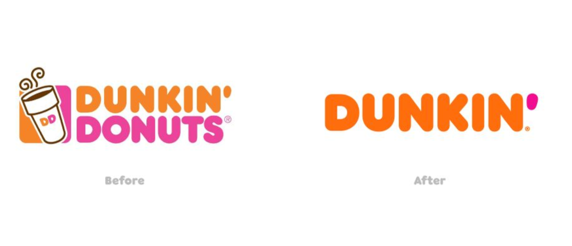
Dunkin's transition from "Dunkin' Donuts" represents masterful evolutionary rebranding that preserved brand equity while reflecting business reality. The company had already been using "Dunkin'" in their "America Runs on Dunkin'" tagline since 2006, making the name change feel natural rather than forced when it was officially implemented in January 2019.
Research conducted by Visual Objects found that 34% of people immediately noticed Dunkin's name change, demonstrating strong brand awareness. They maintained signature orange and pink colors, typeface, and overall visual identity while simply dropping "Donuts" to better represent expanded beverage and food offerings. Multiple branding experts praised the approach for following existing customer behavior patterns rather than forcing new habits.
MasterCard's Logo Evolution

MasterCard's logo evolution demonstrates how visual brands can successfully modernize by strengthening rather than replacing their most recognizable elements. The 2016 rebrand by Pentagram laid the groundwork by separating the wordmark from the interlocking circles, anticipating future uses where the symbol could stand alone.
In 2019, the company successfully removed the wordmark entirely, after research showed that more than 80% of consumers could recognize the brand from just the interlocking circles. This success came after extensive customer research to identify which elements carried emotional value and which could be safely updated for digital optimization.
Prevention Strategies: Early Warning Signs
Most rebranding disasters follow predictable warning patterns that businesses can identify and address before committing to expensive changes:
-
Internal disagreement about brand direction represents the most reliable predictor of rebranding failure, as companies rarely succeed in external communication when internal stakeholders can't agree on brand identity.
-
Customer research deficiency creates another major warning sign, as companies often rebrand based on internal assumptions rather than external validation. The most common mistake involves asking customers what they want rather than understanding what they value about existing brand elements and why those elements matter to their decision-making process.
-
Timeline pressure and budget constraints frequently force companies to skip essential validation steps, turning rebranding into a one-time gamble rather than an iterative process. The most successful rebranding efforts build in testing phases, rollout flexibility, and contingency planning that allows course correction when initial market response indicates problems.
Key Takeaways for SMB Leaders
These unsuccessful rebranding examples teach fundamental lessons that every business leader should understand before considering brand changes:
-
Customer research beats internal assumptions — Never rebrand based solely on internal perspectives. What seems obvious to employees often surprises decision-makers when validated with actual customers.
-
Evolution outperforms revolution — Gradual modifications that preserve recognition value succeed far more often than dramatic overhauls that force customers to relearn brand associations.
-
Digital amplification demands careful planning — Social media amplifies both positive and negative responses instantly, making rollout planning and crisis management preparation essential.
-
Industry context drives risk assessment — Professional services need credibility, consumer goods require shelf recognition, and technology companies must focus on user experience continuity.
-
Preserve brand equity above all else — Existing customer recognition represents real economic value that often exceeds the perceived benefits of trendy new designs or names.
The billion-dollar disasters documented here prove that even the world's most successful companies can destroy decades of brand value overnight—but they also show that with careful planning, customer focus, and evolutionary thinking, businesses can modernize their brands while preserving what customers value most.